By Olivia Limone and Nadia Sanchez
According to the U.S. Department of Agriculture (USDA), food deserts are defined as: “Low-income census tracts where a significant number (at least 500 people) or share (at least 33 percent) of the population is greater than ½ mile from the nearest supermarket, supercenter, or large grocery store for an urban area or greater than 10 miles for a rural area.” (Source: USDA). People who live in food deserts generally have less access to fresh produce and grains, a key part of a healthy diet.
By contrast, the term food swamp has emerged to characterize any area (urban or rural) as a “spatial metaphor to describe neighborhoods where fast food and junk food inundate healthy alternatives.” Research has also found that in the United States, “low-income and racial-ethnic minorities are more likely than whites to live near unhealthy food retailers, which has been associated with poor diet.” (Source: Journal of Environmental Research and Public Health, 2017)
Why does it matter? Poor diets, like those associated with the intake of processed fast foods, can lead to worse public health outcomes and increased risk for diseases such as type 2 diabetes. This raises important questions such as the reason for oversaturation of access to unhealthy, cheap food in low-income areas (specifically areas with low-income people of color), how neighborhood demographics most likely influence the actions taken by the food industry and community decision-makers, and the consequences of such choices made by these entities on the built environment and the people living within it. Food deserts are usually correlated with poor health outcomes and food insecurity, which means a lack of access to food needed to live a healthy, active life. (Source: Food Bank NYC)
In this blog post, we’re going to answer the following questions in order to better understand the links between food insecurity and public health outcomes using neighborhood demographics in Manhattan and the Bronx.
16% of Bronx residents and 13% of Manhattan residents live in food insecure households. (Source: NYC Food Metrics Report, 2018)

- Are there food deserts in Manhattan and the Bronx? If so, where?
- How accessible are low-income areas to supermarkets in comparison to high-income areas?
- Where are food swamps? Are they correlated with negative health outcomes?
We chose these three questions as a way to find out if food deserts could exist in a large city like New York, and if the potential existence of food swamps in conjunction with food deserts could lend to negative public health trends in these areas.
We rely on mapping for most of our analysis because our questions look for spatial information. We will use graphs to complement our maps to hone in on some more specific details.
Some key assumptions:
- For Question 1, we are using access to food retail stores to measure whether an area is a food desert or not.
- We chose Manhattan and the Bronx for our analysis because these boroughs have the lowest rates of car ownership, so we can assume that the majority of people walk to get their groceries and therefore can use the same distance radius for each grocery store (more on this in Question 1).
- Although the USDA defines food deserts in urban areas as further than a half-mile, we chose to look at a quarter-mile walking distance to not overwhelm the map and to portray a more realistic image of how far New Yorkers would walk to get food. We assume that an able-bodied person can walk this distance in 5–10 minutes.
- For Question 2, we assume that Friday at 6:30 PM is a popular time that one would go grocery shopping as it is after work but usually before the time a typical retail food store would close.
- For Question 3, we define “food swamps” as areas that are “saturated” with unhealthy food options. To portray this, we will map fast-food restaurants.
More specific methodology on how we approached each question and the analysis for each step can be found under that respective question’s section.
Methodology
Step 1: Plot retail food stores on a map of Manhattan and the Bronx
To answer the first question, we used mapping software (QGIS) to plot every retail food store in Manhattan and the Bronx. Our first step was to clean up the data using a coding software (R studio). We filtered out full retail food stores (like grocers, full-service stores, and big-box stores) from delis and bodegas from our original dataset. We did this because when looking at food access, delis and bodegas normally do not carry fresh fruits and vegetables, and are not as expansive as a normal retail food store.
We then designated stores as delis/bodegas, grocers, full-service, and big box stores based on their square feet (<2,000sqft, 2,000–5,000sqft, 5,000–15,000sqft, >15,000sqft, respectively). We chose these designations because as we went through the original dataset, we saw the names of the stores followed patterns based on how large they were. For example, at the beginning of the dataset (sorted by ascending floor area), retail stores with the smallest area usually had “deli” in the title. Above the 5,000sqft mark, we began to see common chain names (Keyfood, C-Town, etc.). Big box stores like Target began to show up after 15,000 sqft. I used “grocers” to designate stores bigger than delis, usually carrying a full array of food, but are smaller than typical full-service supermarkets.
(Note: In the suburbs and rural America, big-box stores would probably be closer to 50,000sqft, but since we are talking about NYC, everything is more condensed.)
Step 2: Add a “buffer” to each retail food store to denote the walking distance
A buffer is a circle that surrounds a center point. Here, the center point is a retail food store. The radius around it denotes a 0.25-mile walk from the food store in any direction. A 0.25-mile radius would show a 5–10-minute walk (obviously depending on one’s height, age, health, and other factors that makes a person walk faster or slower). We did this because we wanted to see how far a person could reasonably walk to a retail food store. The idea behind the buffer is that anyone who lives within this radius is within reasonable walking distance of that particular supermarket.
Step 3: Compare map to varying population densities of Manhattan and the Bronx
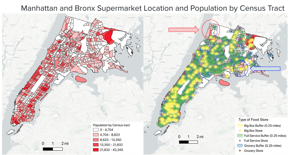
We put the map of the food retail store locations next to a map of the population by census tract because we wanted to see if concentrations of retail food stores correlated with concentrations of people (i.e., more people = more retail food stores).
Step 4: Find out if any gaps in the map can be explained by other factors
We noticed two “gaps” in the map (i.e., where there seems to be a dearth of retail food stores). See the map below for circled areas. Are these areas actual food deserts? The USDA defines food deserts as places with low-income and less-accessibility to food. We compare the original map to two maps, one showing car ownership rates and another showing median household income. These areas have higher rates of car ownership and also higher income. Because rates of car ownership in these areas are higher, retail food stores can be further spread apart and still accessible since people do not have to rely on walking. Higher-income raises the likelihood that one can afford food that is in their vicinity.
Visuals


Findings and Analysis
From these maps, we find a few key things:
- Looking at Map 1, we see that retail food stores are concentrated in census tracts where there are more people. Broadly speaking, this shows that where there are more people, there is more food to account for the higher population (generally a good thing). Most of the map is covered by the buffers, meaning that everyone who lives within those buffers theoretically lives within a 5–10-minute walk of a grocer, full-service supermarket, or big box store.
- There are two areas in the Bronx (Throg’s Neck and Riverdale) that have (what seems like) the least food retail access because these census tracts are least covered by buffers. To find out if they can be considered food deserts, we looked closer. These areas have comparatively higher incomes and higher rates of car ownership than other areas, which suggests the ability to drive to retail food stores and afford the food there. Therefore, we determined that these are not, in fact, food deserts. From this map, there are no food deserts in Manhattan or the Bronx by the traditional definition.
Food retail store locations tend to correlate with the population size in Manhattan and the Bronx.
Methodology
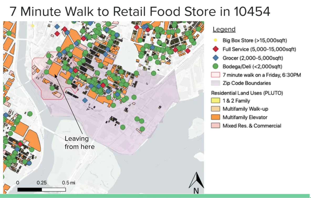
After the findings of the first question, it would seem that there are hardly any areas of Manhattan and the Bronx that lack access to food if we were to go off the basic definition of food desert (i.e., physically far removed from a retail food store). Since the U.S. Department of Agriculture defines food deserts as low income AND less accessible, we decide to next look at the “low-income” side. So our next step is to compare high and low-income zip-codes and see how they differ. To see this, we are going to compare what a seven-minute walk looks like from a residential building on a Friday, 6:30 PM in the three lowest and three highest income zip codes.
Step 1: Locate low and high-income areas of Manhattan and the Bronx
Using census data, we made a map that portrayed median incomes of each zip code of the Manhattan and the Bronx, with darker sections portraying higher income. Here we find that the lowest and highest income areas. The lowest income zip codes were largely in the South Bronx, and the highest was in largely in Southern Manhattan (Financial District, TriBeCa) and a sliver in Midtown West. From here, we chose the three most extreme zip codes and analyzed them closer (see Step 3).
Step 2: Add land use data and retail food store points to the map to find residential building lots
“Land use” describes what land is used for (whether that is residential, manufacturing, commercial, etc.). NYC’s planning department has a color code for every building that portrays what that building is used for. We added this to our map, but got rid of any type of use that was not residential. We colored the parts of the maps that were not residential gray, as to not clutter the map. We did this for our “walking analysis” (More on this in Step 4).
Step 3: Create maps of each respective zip code
We created a separate map of each zip code and highlighted the zip-code boundaries. In addition to the land use residential colors, we added all of the types of retail food stores (bodegas/delis, grocers, full-service, big-box) to the map.
Step 4: Analyze “real” walking time, starting from a residential location that looks relatively removed
We then used a tool in our mapping software, QGIS, called “TravelTime.” This neat tool gives a realistic look at what a walk looks like given the time, day, and geography. We chose a residential location that looked furthest away from retail food stores and got the red radius which denotes the distance that could be covered in 7 minutes. We chose 7 minutes and Friday at 6:30 PM for the reasons given under the “Methodology and Assumptions” section.
Visuals
What zip codes have the lowest incomes?

And what zip codes have the highest incomes?

Let’s look at the three zip codes with the lowest incomes:


And now let’s look at the three highest-income zip codes:


Findings and Analysis
- With the exception of zip code 10282, big-box stores tended to only be within walking distance for the other two Manhattan/highest-income zip codes.
- The three Bronx/low-income zip codes lacked big-box stores but seemed to have more full-service, grocers and bodegas/delis than the Manhattan/high-income zip codes.
- The most noticeable difference between the high and low-income areas was that the low-income areas had significantly more bodegas/delis, despite not being more concentrated than the high-income areas.
So what does this mean? Traditional knowledge about food deserts tells us that poorer areas tend to have less food access than wealthier areas. However, here, we see that is not the case. The low-income areas seem to have more food access. This begs the questions — what kind of food access is this? What is the quality of the food? Can residents afford what is sold to them in these retail food stores? Bodegas and delis have a reputation for being less healthy than your traditional grocer, as they often do not sell fresh fruit and vegetables. However, the other three types of retail food stores most likely sell fresh produce. This leads us to our next question about food swamps…
(Side note: With regards to the big-box stores, this discrepancy may be due to the fact that big-box stores sell clothes, electronics, furniture, in addition to groceries. It may be economically beneficial for some of these retailers to locate in high-income, and therefore high-spending, areas of the city. Although with only two examples, we can not say anything too definitive, as it may just be a coincidence.)
Methodology
Step 1: Map population density by zip code
We mapped population density using Census data in order to see if higher concentrations of fast-food chains only correlated with certain areas because of the increased population.
Step 2: Map top 15 fast food locations to find out where there are concentrations of “food swamps”
Using the State of the Chains report by the Center for an Urban Future, we determined the top 15 fast-food chains in NYC. Using the NYC Open Data Restaurant Inspection Data set, we then mapped the locations of the fast-food chains onto the map of Manhattan and the Bronx to find out where there were concentrations of “food swamps.” After plotting all the points, we created a graduated colored map of fast-food locations, meaning that areas with more fast-food chains were darker than areas with less.
Step 3: Map diabetes concentrations by Neighborhood Tabulation Areas (NTAs)
Using information from the Pratt Institute’s Neighborhood Data Portal, we mapped areas with high concentrations of poorly-controlled diabetes. Notably, this data is provided in percentages, so population density would not skew the results. We mapped this data by using a graduated color scheme, with darker colors representing a higher percentage of the population with poorly-controlled diabetes in that respective area.
Visuals
Where are fast food locations in Manhattan and the Bronx?

Is there any relation between fast food locations and negative health outcomes?

Are health outcomes more a measure of income distribution?

Findings and Analysis
From the map of population density and fast-food chains, we see that there is no direct relationship with a higher population and more fast-food chains, except for in Midtown West, a dense, high-income and popular tourist area, which may explain the high density of these establishments there.
This leads us to look at food swamps in comparison to low-income zip codes. Are there concentrations of food swamps in low-income areas? Here, we see that there is some relationship between low-income areas and high concentrations of fast-food establishments (such as in 10029, East Harlem and 10455, South Bronx), but this pattern isn’t seen in every low-income zip-code (e.g., 10454, South Bronx, has a low concentration of food chains). The top 5 zip codes with the highest concentration of fast-food establishments in both boroughs are (1 being highest, 4 & 5 tied):
- 10455 (BX) Mott Haven (20)
- 10019 (MH) Hell’s Kitchen (19)
- 10029 (MH) East Harlem (18)
- 10001 (MH) Chelsea (15)
- 10027 (MH) Morningside Heights (15)
However, when examining both boroughs broadly, there are many more zip codes in Manhattan with absolutely no access to the top 15 most popular fast-food restaurants (73 out of 112 zip codes) while in the Bronx there are only 8 zip codes with absolutely no access to the top 15 most popular fast-food restaurants (out of 28 zip codes). 65% of Manhattan’s zip codes have zero fast food restaurant, while 71% of Bronx zip codes have at least one fast-food restaurant. And both boroughs are nearly the same in population, with the Bronx having about 1.5 million residents and Manhattan having about 1.6 million residents.
Within Manhattan, the highest consistent amount of fast-food chains in Manhattan appear to be in the upper part of the borough, areas with lower-income as compared to the rest of middle and south Manhattan. However, individually, Hell’s Kitchen and Chelsea have the highest concentrations of fast-food establishments, despite being generally medium to high-income. However, as mentioned above, these are popular tourist destinations, which may explain the relatively high amount of these establishments.
Lastly, we look at concentrations of poorly-controlled diabetes and concentrations of food swamps. While there is some overlap, we cannot conclusively say that there is any correlation, as diabetes-heavy areas do not directly align with areas that have more fast-food chains. Rather, there seems to be a relationship between areas with high-concentrations of diabetes and low-income areas. While we cannot say that this is because of food deserts and food swamps, as our original question proposed, we can observe that there is a definite relationship between having less income and having a higher probability of having poorly-controlled diabetes. These findings also suggest that although Manhattan has more of the top 15 fast-food restaurants (220) compared to that of the Bronx (131), the restaurants in the Bronx are much more dispersed throughout the borough’s zip codes while in Manhattan they are more concentrated in certain areas, such as those with high tourism or lower income. Also in Manhattan, the majority of its zip codes that have little to no access to these fast food restaurants are also primarily high-income areas, such as 10007 (Tribeca), which is the most expensive zip code in all of New York City and only has three fast-food chain establishments.
Given that the Bronx is the poorest borough in New York City, it is also interesting to note that zip code 10471 (Riverdale), which is one of the 8 neighborhoods containing no access to the top 15 fast-food chains, is also similarly the highest income neighborhood in the Bronx.
While more research would need to be done to find an actual statistically significant relationship, we hypothesize that this is due to the fact that low-income people generally have worse, if not no, insurance and therefore, have worse health outcomes than their higher-income counterparts.
While being low-income may not predict your fresh produce access, as we see equal access in both high and low income areas, being in a low-income area may predict your health outcomes.
Food deserts alone do not explain all the causes of food insecurity in NYC and the U.S. at large. Looking at the findings from these questions, we see that, perhaps, Manhattan and the Bronx do not have a food desert problem, but an income and food swamp problem.
From Questions 1 and 2, we gather that most places are within walking distance of a supermarket, suggesting that people have access to places that would sell fruits and vegetables. However, just having access isn’t enough if people can’t afford the fruits and vegetables being sold there. Secondly, we see that many low-income areas are saturated with bodegas and delis. These may provide cheaper alternatives than traditional supermarkets.
From Question 3, we see some overlap between food swamps and lower-income areas, but more importantly, we see a large overlap between low-income areas and poor health outcomes, which we measured with high rates of poorly controlled diabetes. Having low-income probably suggests worse (or no) health insurance. So in addition to perhaps eating worse, causing higher rates of diabetes, low-income people have less access to medicine due to poor insurance. Fixing healthcare is an entire other blog post, though.
To New York City’s credit, the City Council has already taken on some steps to make healthy food more accessible, such as:
So how do we fix food insecurity? Ultimately, long term support of these programs, education, and money will help improve the health and food security of New Yorkers. This involves:
- Promoting healthy eating through education and incorporate healthy eating into schools’ health curriculums
- Providing healthy and delicious food for school meals
- Subsidize fresh produce to make it an affordable option
- On the federal level, elect politicians who will expand SNAP funding and support other legislation aimed at promoting overall economic security and reducing economic disparities
Overall change to fight food insecurity and poor public health has to be more radical (in both senses of the word: fundamental and revolutionary). Access to fresh food alone will not solve any problem if people don’t have the money to buy it nor the time to prepare it, while already being addicted to quick, cheap, and delicious fast-food. We must promote a society that prioritizes economic equality to ensure that not only nobody goes hungry, but also a society that cares about the health of its citizens by providing good healthcare as a universal right.
How we cleaned up our data for Questions 1 and 2 (using R)
How we created our maps (using QGIS)
How we created the bar graphs in Question 2 (using Python)
How we created our bar graphs in Question 3 (using Python)
And check out our presentation! (Google slides)
Question 1:
Question 2:
Question 3:
Sources for facts and figures (and to learn more about food insecurity):
- 2018 NYC Food Metrics Report, NYC Office of Food Policy
- Research and Reports, Food Bank NYC
- United States Department of Agriculture, Food Access Research Atlas
- American Heart Association, Food Desert Infographic
- Hunger Free America, NYS and NYC Hunger Report 2018
- Rose, D.; Bodor, N.; Swalm, C.; Rice, J.; Farley, T.; Hutchinson, P. Deserts in New Orleans? Illustrations of Urban Food access and Implications for Policy; University of Michigan National Poverty Center; USDA Economic Research Service Research: Ann Arbor, MI, USA, 2009.
- Brownell, K., Cooksey-Stowers, K., Schwartz, M., Food Swamps Predict Obesity Rates Better Than Food Deserts in the United States; International Journal of Environmental Research and Public Health: Hartford, CT, USA 2017